User Testing
Based on the Heuristic Feedback on the Wireframes and Navigational Skeleton, I came up with a list of changes and updated the prototype.

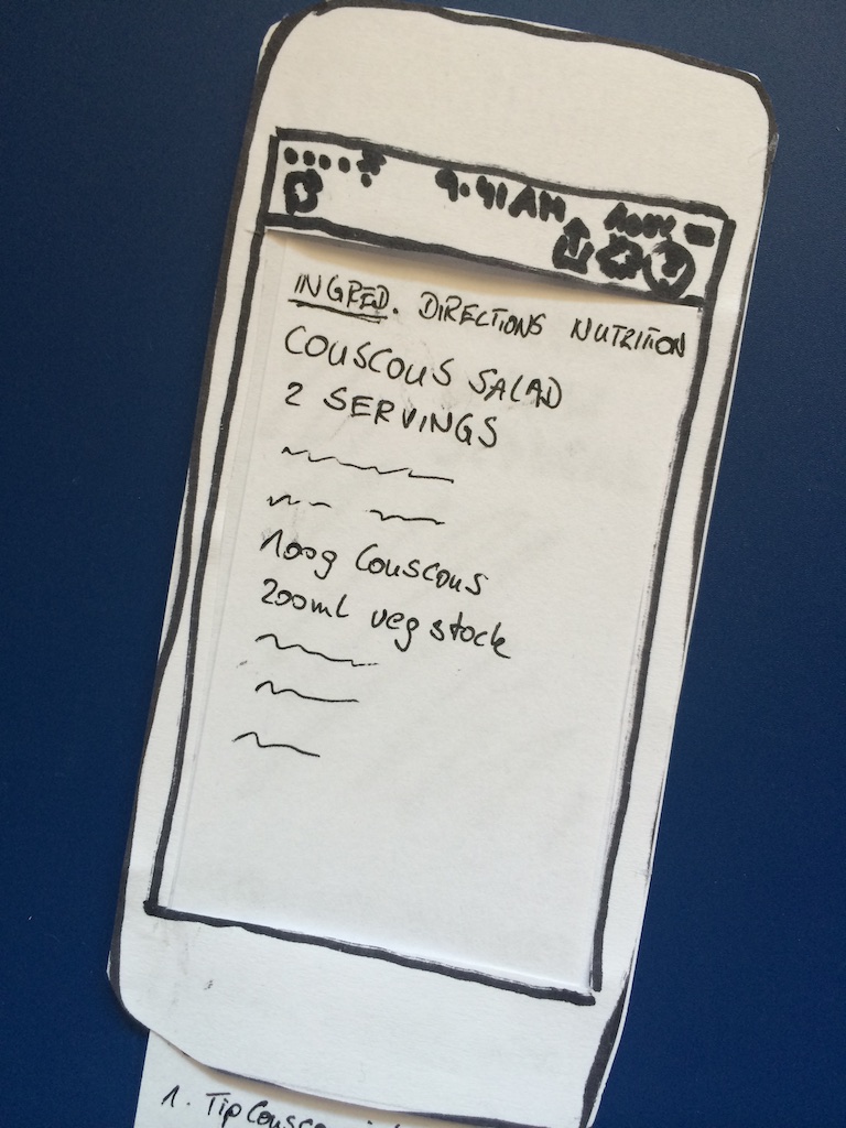
Ingredients Screen 
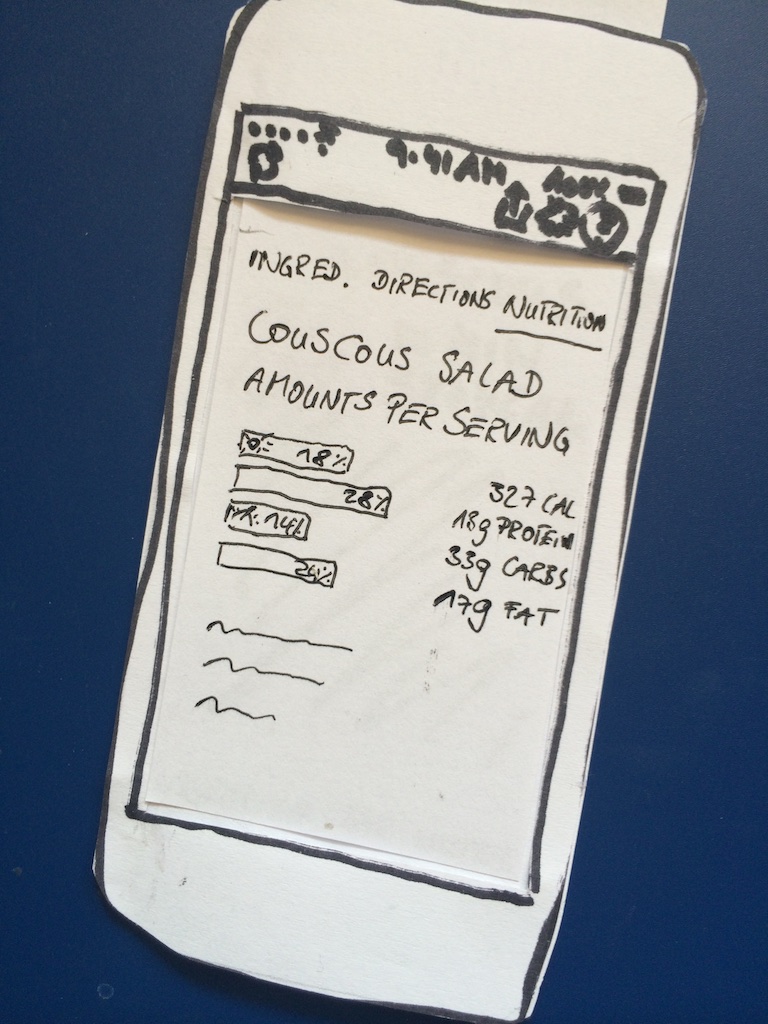
Nutrition Screen 
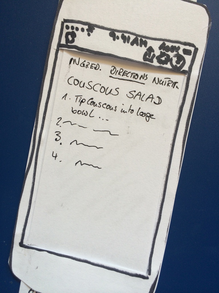
Directions Screen 
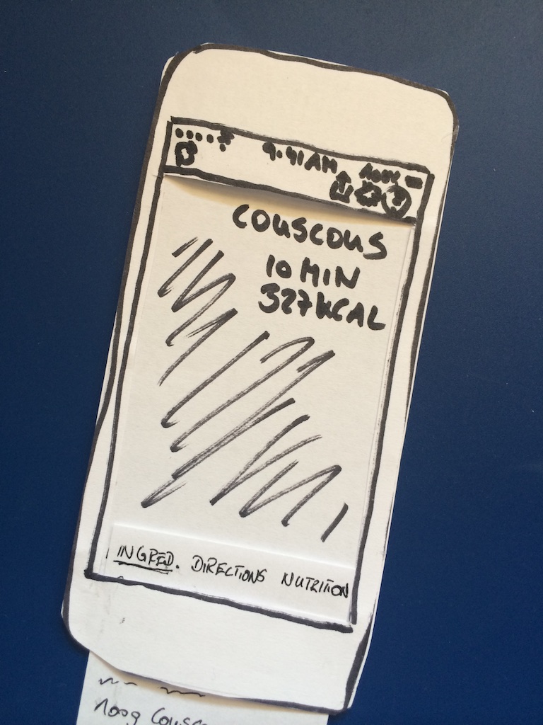
Recipe Screen
I redesigned part of the interaction as a paper prototype to get an alternative view (My redesign turned out to be significantly better than the original design, so I incorporated it into the final prototype).
I produced an evaluation plan for structured subsequent user testing, as well as consent forms, instructions to be read to participants, and questionnaires to be filled out after each test.
Here’s the evaluation plan:
Goals
- Find out if the app is easy to use
- Can participants find ingredients and directions?
- Can participants find an alternative recipe?
- Can participants find out how to change settings?
- Find out possible improvements
- Are two alternative recipes enough?
- How important is the nutrition info?
- Where do participants want to save nutrition info?
- What else would participants like to see?
- Find out if the app helps to make healthy choices
- Would it increase the likelihood of cooking a healthy dinner?
- What else would increase the likelihood?
Participants
I will recruit coworkers and family members to test the app out of time and location constraints. Since the target user of the app would be a busy person who is typically at work during the day, this is a good match.
Requirements: 3-4 participants, Employed or self-employed, Diverse age and gender to give divergent perspectives
Resources
Personal Computer to interact with prototype iPhone camera to record interactions Test instructions to read out to participants Consent form Post Test Interview / Survey
Methodology / Setup
- Tests 1 and 2: 14./15. August 2014, Germany / Test 3 and 4: 20./21. August, London
- Duration: 30 minutes per test
- Setup: Mobile Computer with Silverback software installed, Prototype ready to use, iPhone for photos
- Participants will be asked to think aloud while performing tasks
- Procedure:
- Sign consent form
- Pre-Test Survey (dinner habits)
- Set up computer
- Read test instructions
- Start test
- Post-Test Interview
- Measures: time to complete each task, Interview answers
Tasks that users will perform
Find out which ingredients are needed for the recipe and directions how to cook it Find a different recipe Find out how many grams of carbs the recipe includes Assume you cooked the recipe – now save the nutrition info to MyFitnessPal Change your dietary requirements to Low Carb
Interview Questions after task completion
- Ease of use
- Do you know how to find out the ingredients and directions needed to make the recipe of your choice? Were they easy to find?
- Do you know how to get an alternative recipe?
- Do you know how to set your personal preferences and dietary requirements? Easy to set?
- Do you know how find out nutrition info for a recipe? And how to share?
- How intuitive was it to use the app, if you compare it to other apps you’ve used?
- Can you tell me a bit more about which part(s) of the test you found difficult to do? Why?
- Possible improvements
- Did you think the choice between two recipes was enough?
- Do you typically track nutrition info? How?
- What would you change about the app? And why?
- Are there any features you’d like to add if you had the chance?
- Does app help with healthy choices?
- How appealing does the recipe presentation look to you? (1-low to 4-high)
- How likely will you cook dinner at home tonight?
- Would you be interested in using an app like this? If no, why not?
These are images of the actual user test sessions:


And this is a summary of the issues I found with the design during testing and that I would want to work on for the next iteration of the prototype:
- It is not easy to discover the “swipe” gesture to get to ingredients, directions, and nutrition. The redesigned scrollable version with buttons was much easier and preferred by all users.
- Users associated the swipe gesture with getting to the “next” recipe. Little dots at the bottom should indicate the option to swipe (similar to the dots that indicate when there’s more than one homescreen with apps).
- Users clicked on the recipe name to get to the recipe info when they should have swiped.
- The wording to save nutrition info needs to be improved, the action and confirmation aren’t consistent.
- The icons for Macronutrients aren’t easily understandable, and there isn’t (yet) a standard that is widely used.
- One user would like to tick off ingredients from her list once she bought them. This should be easy to implement.
- Users didn’t find two choices of recipes enough. Maybe the app needs a setting for how many recipes to download – or change to 5. In addition, when there are more than two recipes, there need to be a way to return to any previous ones.
- Another request was to save favourites and eventually create a personal recipe book. Not quite as easy to implement and beyond initial scope.
- Along the same lines was the request rate recipes and/or see other user’s ratings.
- In addition to excluding certain foods, users would like to find recipes based on “what’s in their fridge” and by certain categories, i.e. soups/salads, etc. However, this was not part of the initial idea / storyboard I decided to focus on.